video

Significance & Logos

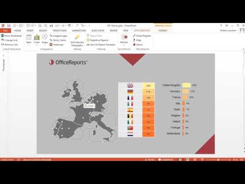
Significance is visualized by matching a specific color with a specific picture or shape. The background color of Excel cells can than be visualized in PowerPoint using the corresponding shapes, e.g. arrows. Specific texts can automatically be replaced by images/logos. OfficeReports does this by looking for image files with the same name as the text in Excel in the folders you have specified. In case an image file is found, the image is shown instead of the text.

For a detailed explanation, please read this blog-post.
Quadrant chart

This kind of chart takes a long time to do manually. Especially when the axes of the 4 quadrants has to placed in the avarage value. So let OfficeReports handle this for you in seconds. In case the labels are a bit longer, you have the option to show the texts i a table beside the chart, so the chart still is readable. The option to create a table for the texts is also available for creating ordinary XY Scatter charts.

Diverging chart

Another very useful chart type, which is almost impossible to create manually in PowerPoint. The chart is created by 'cheating' the ordinary Bar chart by making some part of the chart invisible.

Vertical Line chart

Again a chart which is incredibly hard to make in PowerPoint. Using OfficeReports, it is just one of your standard chart types.