OfficeReports Link
Populating PowerPoint Charts, Tables and Shapes from Excel
It is a fact that data presented in a PowerPoint presentation often is manually copied from an Excel workbook. To make presenting data in PowerPoint faster, more accurate and updatable, OfficeReports now introduces a new tool for turning Excel data into PowerPoint infographics. Our new 'Link' product links Excel ranges to tables, charts and shapes in PowerPoint, and is useful for ad-hoc reporting, tracking studies, BI reporting and mass generation of reports. In comparison to our competitors, we add some unique functionality:
- Link Excel data to PowerPoint shapes
- The Excel ranges can have a variable number of rows and/or columns
- Link the background colors from Excel, even from 'conditional formatting'
- Link specific texts in Excel as logos in PowerPoint (tables, charts and shapes)
- Link specific background colors as icons in PowerPoint (tables, charts and shapes)
- Specific texts from Excel can be visualized in specific colors in PowerPoint ('Sticky Colors')
- Macro Integration
Let's have a closer look at it. OfficeReports adds the 'OfficeReports Link' menu to PowerPoint:

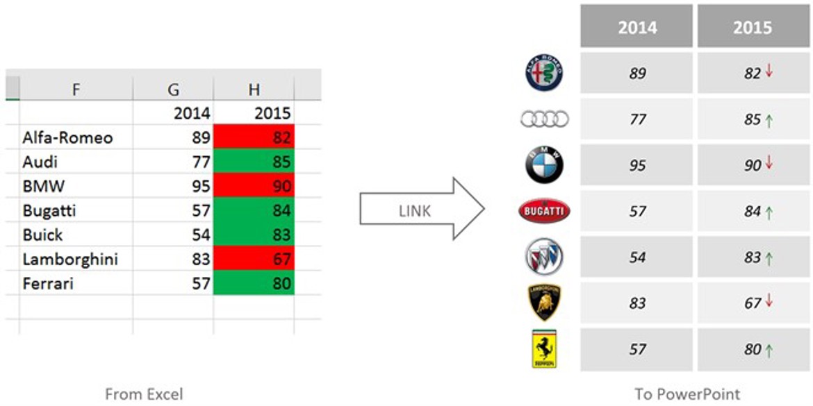
Pictures say so more than words, so here a few examples of what this 'OfficeReports Link' menu can do for you. First, linking a range to a native PowerPoint Table:

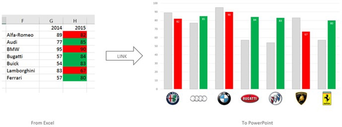
In the next example, the background colors from Excel are linked to a native PowerPoint Chart:

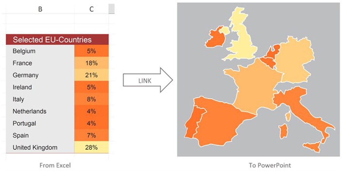
And in the last example, we are linking to native PowerPoint Shapes:

See how easy it is to accomplish this. Have a look at the short video, and read a few posts in our blog. The 'Getting Started' manual will also give you a good impression of the functionality we offer, and will help you get started. To add OfficeReports to your Microsoft Office and try it for free in 14 days, please click here.
All this functionality makes OfficeReports a very good alternative to E-Tabs, ThinkCell and Rosetta Studio.